🛒 Sportwear Vibe
Group project
Overview
A “Sports wear” online shopping for the purpose where consumers can purchase on-trend and affordable women and men’s sportswear to channel their fitness regime from anywhere with the internet.
Roles
UI design, wireframes, layout, written document, research, gathering requirements, planning, prototype, testing.
Timeline
October 2018 to December 2018
Tools
Visual paradigm, HTML, CSS, JS.
Written documents
Goals
- E-commerce type: B2C (Business to Consumer).
- Production, marketing, sales and distribution of goods to customers via electronics devices (smartphones, laptop, ...).
- The payment or delivery of the goods can be made using various methods
- PayPal, credit/ debit card, Apple Pay, ...
- Standard delivery, next day delivery, ...
- For business: maintaining the websites and update the goods. Provide choices of products from different brands.
- For consumers: be able to purchase the goods of suppliers across different regions, anytime, anywhere.
- For society: the online shopping is suitable for modern industrial life.
User analysis
Target audienceThe target audience mostly consist of people who are mildly - internet aware but the products cater to 16 - 40 year olds which cater to both males and females and all social economic group.
The audience themselves want to be able to have easy and a neat way of accessing their brands of sports clothing. We could understand this as we had previously looked at a few website designs and noticed that there was more easy to understand website layouts with good navigation rather than convoluted and ambiguous design choices; it only takes a few seconds to make a judgment on whether to stay or not on the website when shopping.
Tasks- The target audience wants to be able to buy their stuff in the most convenience
- The target audience wants to ensure they have a variety of payment options available
- The target audience wants to be able to have the ability to specifically change their search options / preference when searching for a particular items
- The target audience will want to have a nice interface to interact with
Design
Site structure
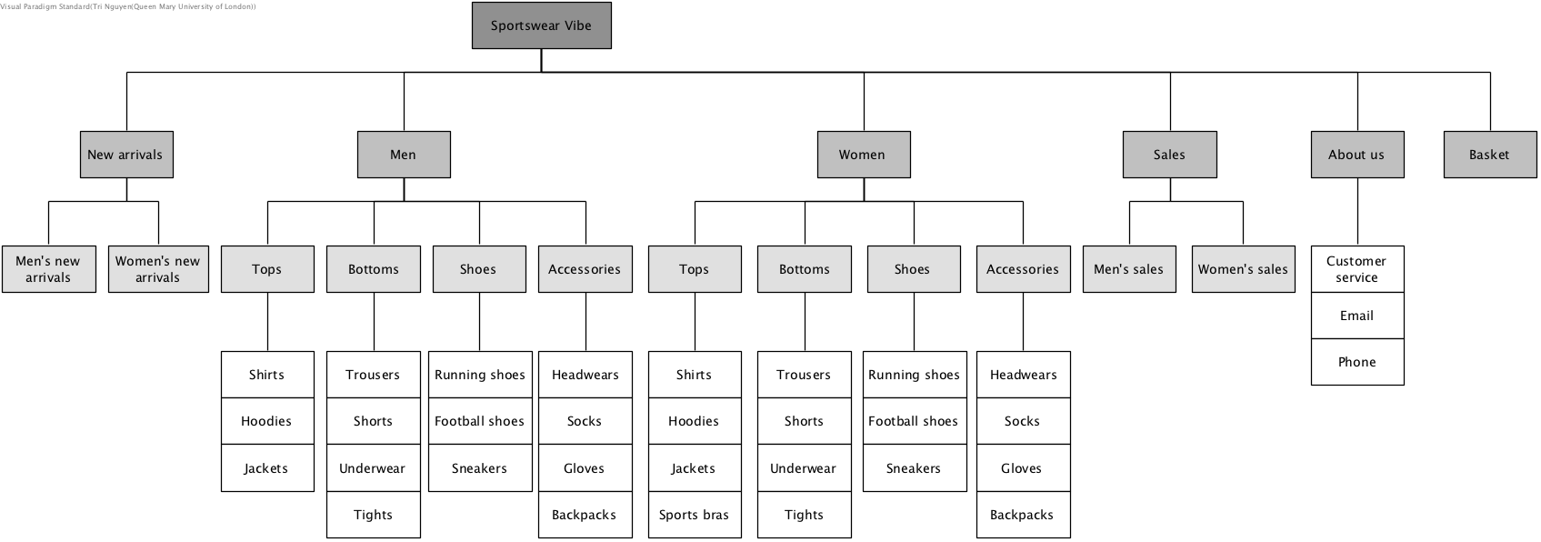
Screen layout
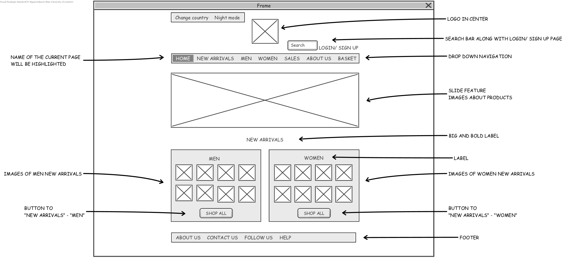
On the home page we have the logo of the company which will be present at the top of the page. Next to the logo there is a search bar which will allow us to search for a specific item on the page. Navigation bar which will give general topics and will slowly specify into specific categories. Below that feature is a featured image which will slideshow various promotional items/ messages etc. After that there is a section dedicated separately for both women and men which shows new items added to the e-commerce.
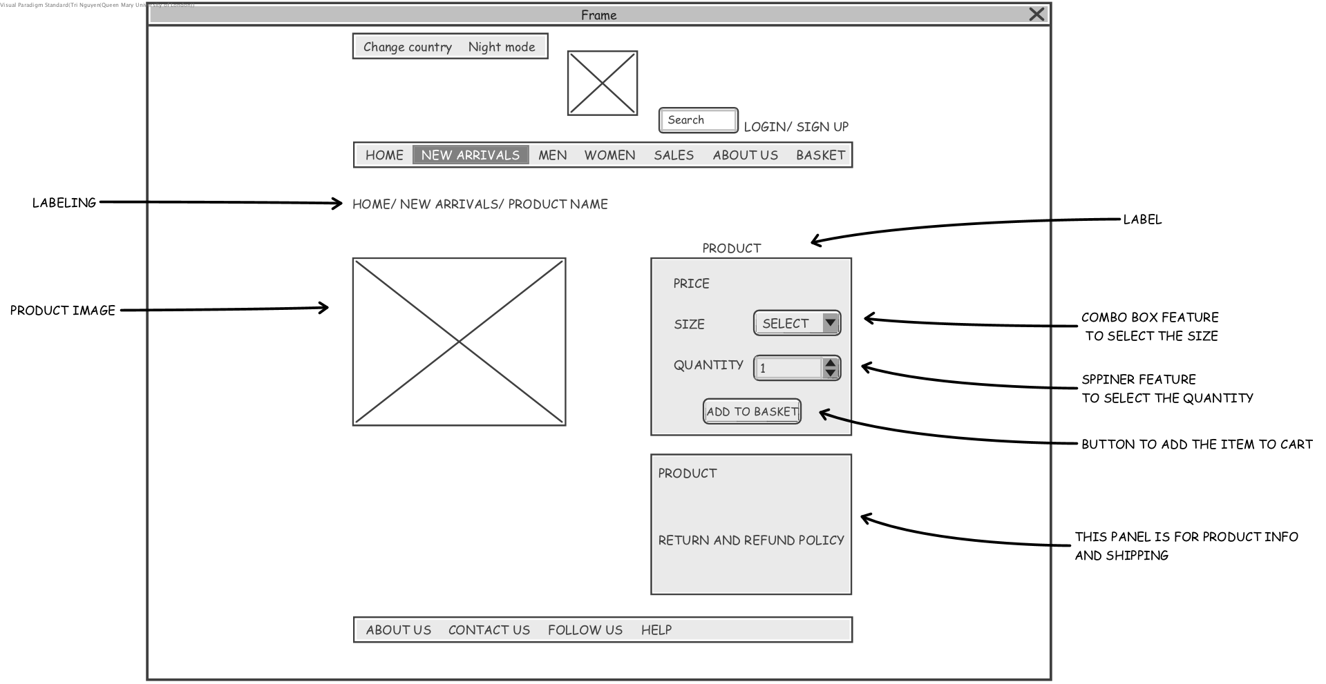
On the product page there’s a label tab which tells the users which webpage they are on, for example it states that this webpage is currently on Home/ New Arrival/ Product Name. On the right hand side there will be a label for the product that will include a combo box feature to select the size of the product and the quantities with a button add to basket . Below there will be a product description and refund policies.
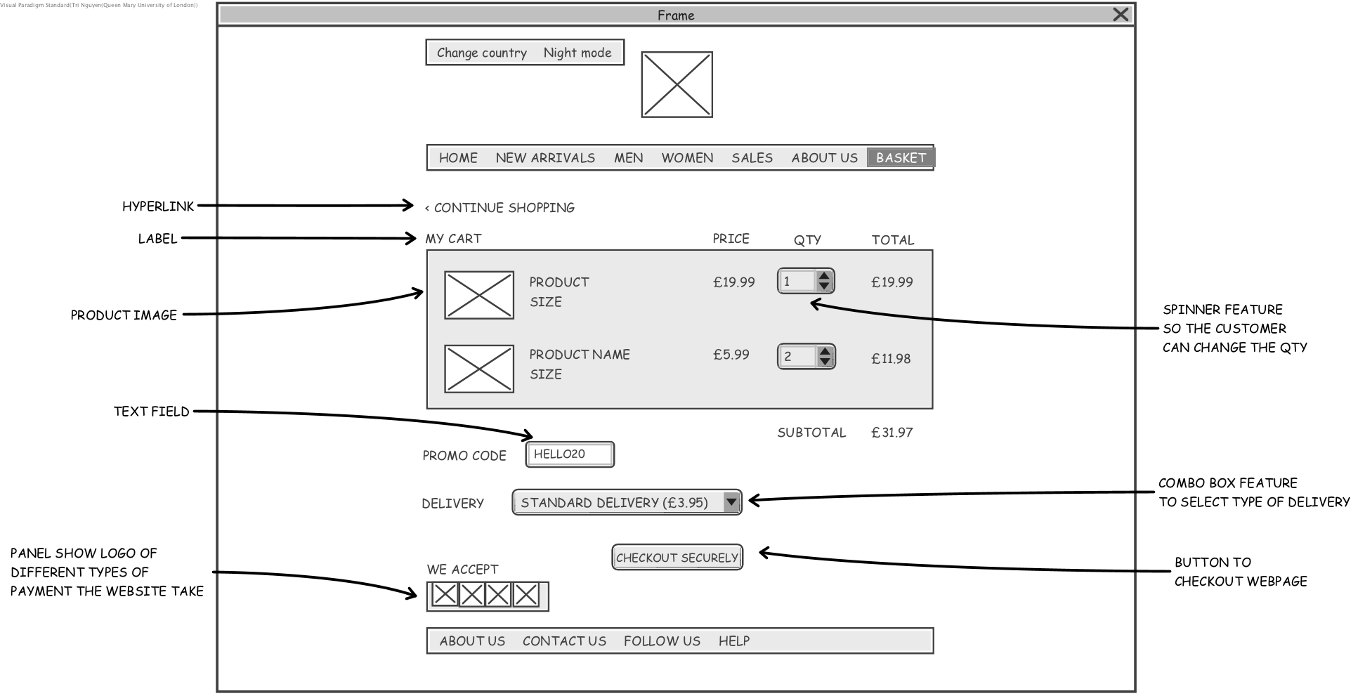
Basket page we will have a hyperlink for the continue shopping tab, this will help the user to redirect back to the main page. Below that is the general information of the basket such as: product name, price, quantity and price. User has the option to select different quantity. There will be a promo code text box for discount. User also be able to select different type of delivery and payment method.
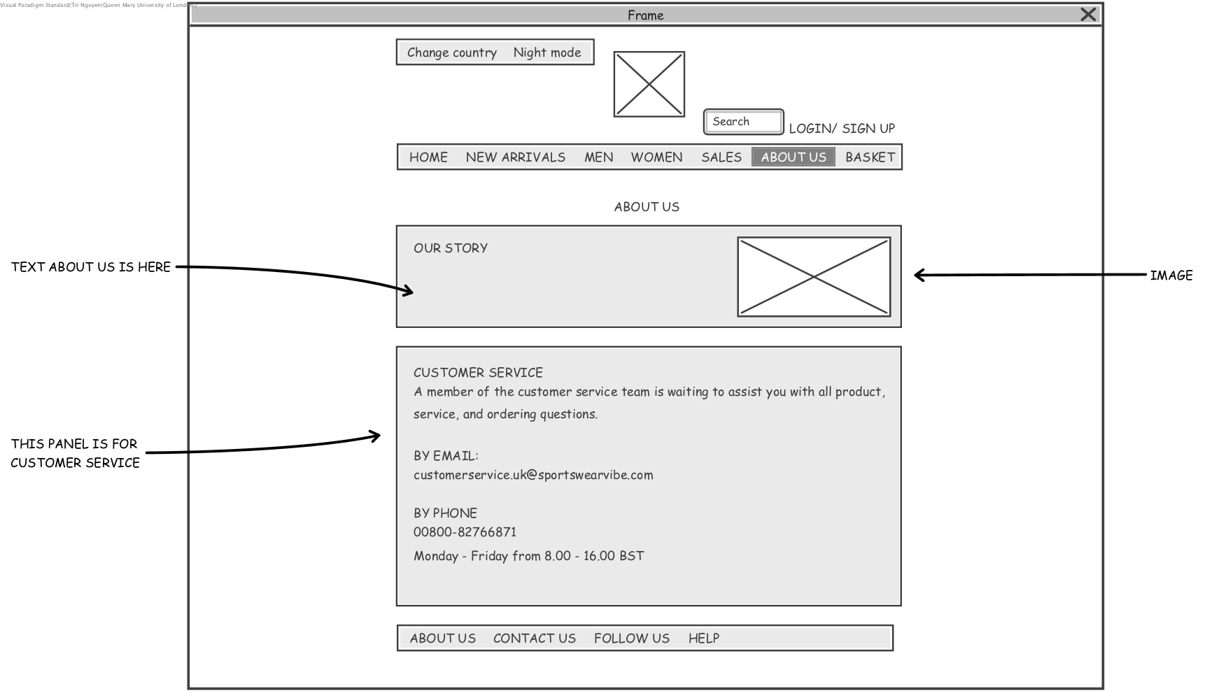
On the about us page we will have a “About us” section which we will include a text box to include a brief explanation about our brand and story. Below that is a text box/panel for the information about our customer service, the email will be transformed into an hyperlink, this means that when you clicked on the hyperlink it will direct you to your mail service, hence users will be able to directly send inquiries to us. There will also be a phone number and our business working hours.
Implementation
Screen 1: Homepage with a drop down navigation bar. There is a slideshow banner on the header page. Product page has hoover effect when you move the mouse over.
Screen 2: View product page has combo box to select different size and quantity with the product description below that.
Screen 3: About us page displayed general information about the service, opening times, ... There is also customer service form for Q&A and any other enquiries need to be answered.
Screen 4: Basket page allows user to check out with different selection of payment methods and delivery.
