🌵 My Indoor Jungle
Personal project
Overview
Are your plants dying?
My Indoor Jungle is an app helps to remind you to water your plants so you don't have to think about it in a simple way.
Roles
UX/ UI design, planning, data gathering, wireframing, prototyping and user testing.
Timeline
March 2021 to April 2021
Tools
Figma and InVisionapp.
The problem
Due to the busy life, sometimes we caught up into work that forgets to check up on our "friendzy housemates" and it eventually died. It's common for people to not remember watering their plants on time. They are mostly unaware of individual water requirements on the plants they own. I strongly feel that the new water reminder app can play a significant role in combating this issue.
The goal
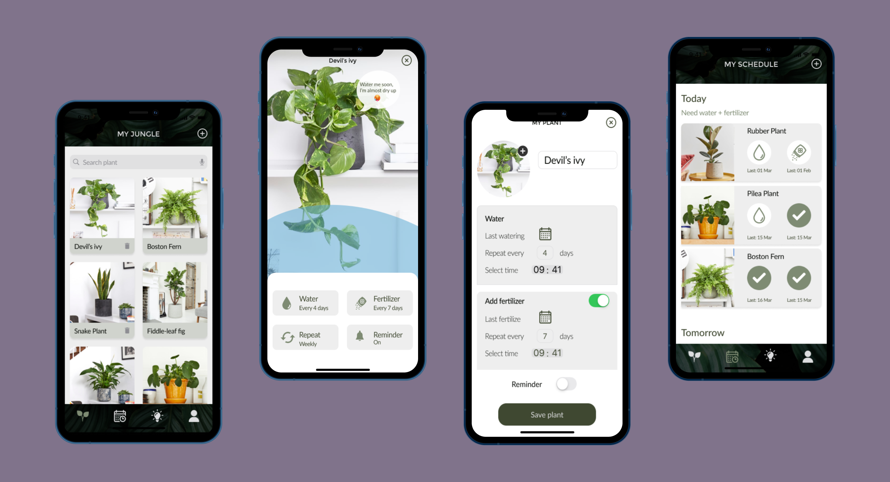
Developing a water reminder app that allows user to manage their plants with unique water schedules, be able to track your scheduling to make sure no plant is left to dry, customize your plants (your babies) by giving each a name and taking plant selfies, edit water schedules, clean interface to get simple tasks done and turn a boring task into a fun activity.
Bonus features: fertilizer reminder and LUX meter (measure light levels).
The process
My process will be different in different projects and will be determined by many factors such as the project goals, business needs, complexity of the problem, time and etc. Here I’ll describe my process for solving this problem.
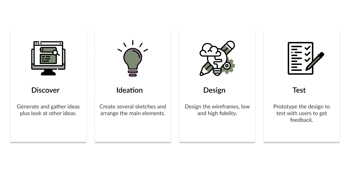
Discover
Understanding the core of the product
Before doing any ideation I started to analyzing the existing design page by page to understand the core of the product. Analyzing comments in the app store also helped me to know the main points and strength of the current design.
Key findings
- Doesn't have a clear UI interaction.
- They don’t feel engage to app.
- Doesn't remind on the correct time set.
- Doesn't have fertilizer reminder. Although it is optional, however it's good to have one.
Initial proposal
Proposed a design with fast access to significant sections (Plants, My Schedule, Lux Meter, My Profile) and made accessibility straight.
- Design principles: clean and friendly UI (colors, icons).
- Plants info page should indicate the water level corresponding how much the plants has dried up.
- Navigation and transition should be easily understandable.
- View/ edit/ delete a plant.
Ideation
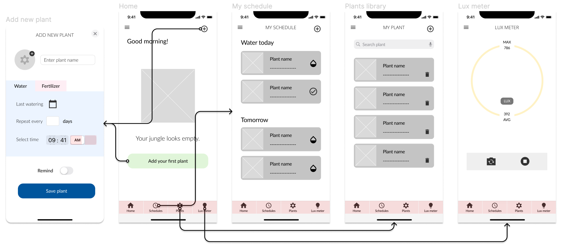
Sketching and wireframes
I had a list of screens to cover all scenarios so I started sketching different designs to detail out the flows to discuss and share with team members to get feedback.
Design
Crafting a holistic look and feel
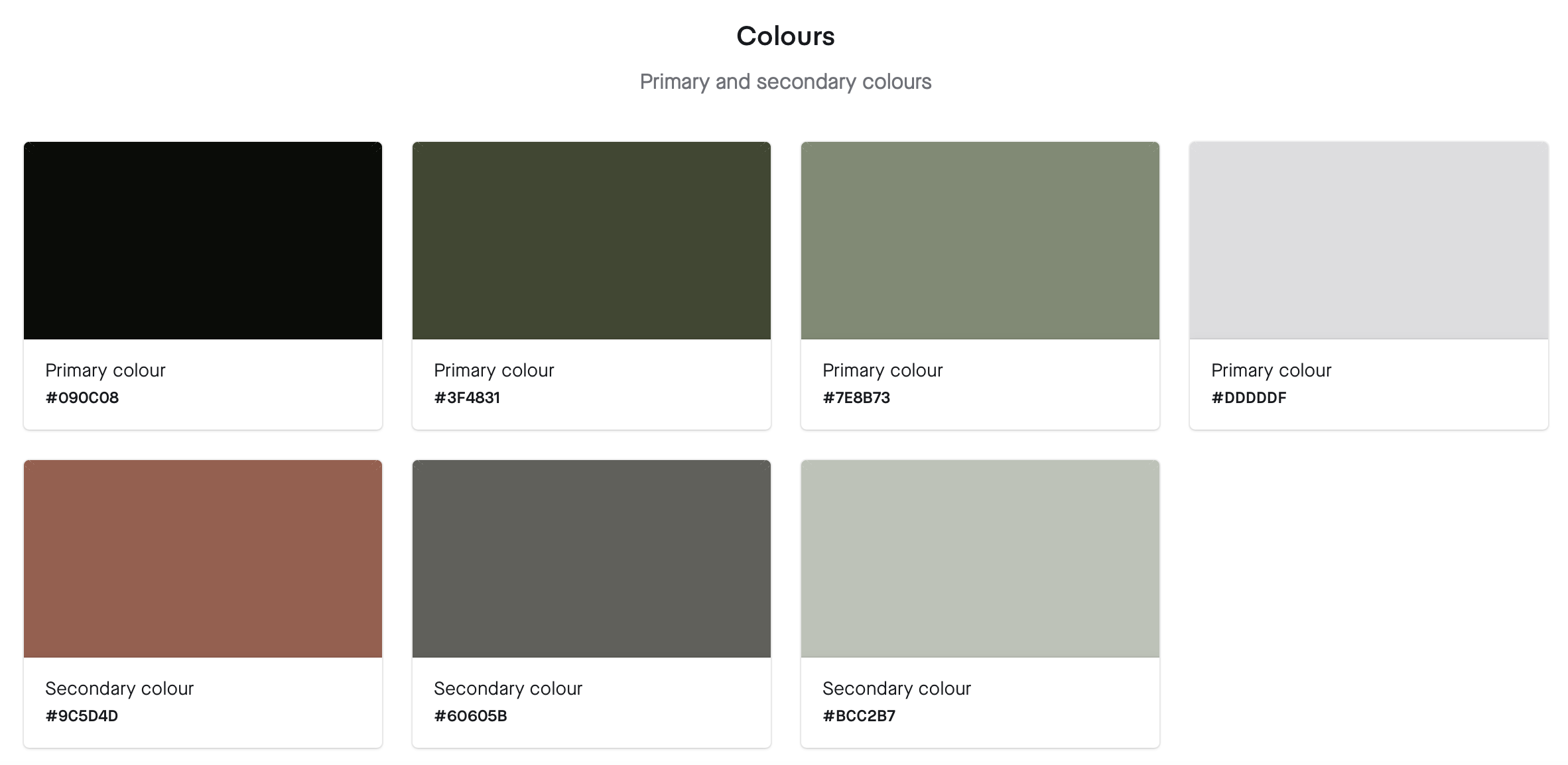
This is a style guide for My Indoor Jungle app. This style guide contains colors, typography, components, buttons and overlays.


User flow
As the saying goes, “A good start is half the battle" . Before going into user interface design, I made sure to polish the features and user interaction flow.
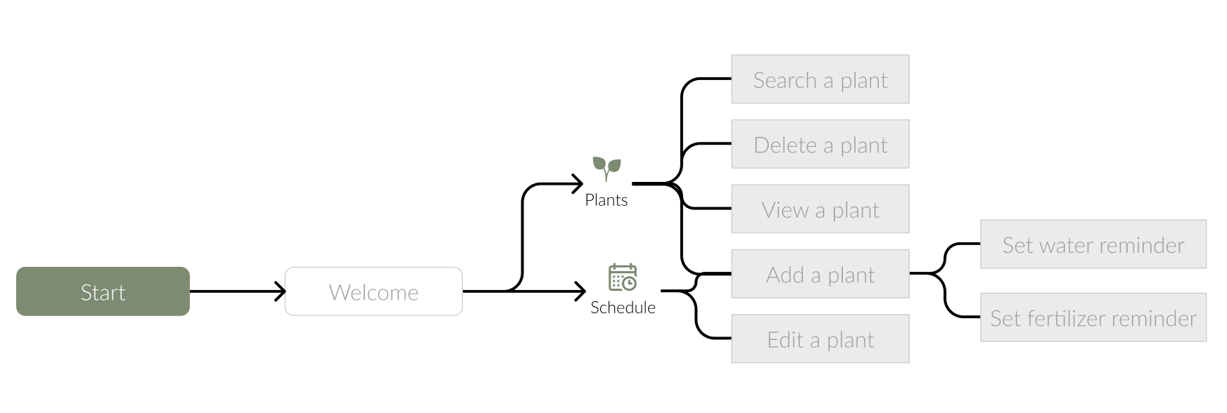
The following feature flowcharts describe the content strategy and user flow through the app, listing potential features users may interact with. The creation of flowcharts are the basis for refining the workload necessary for developers and higher-fidelity designs later on and for discovering potential issues behind the product in a quick and time-efficient way.
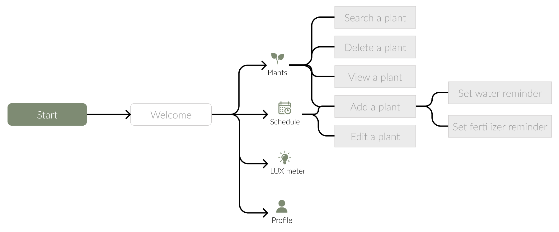
When the users start the app, they will be led through a Welcome page then proceeding to their default screen - the Plants screen. The bottom navbar has 4 tabs options:
Plants — where users go to browse different plants, search/ add a plant and delete a plant.
My Schedule - where users go to add/ edit a plant.
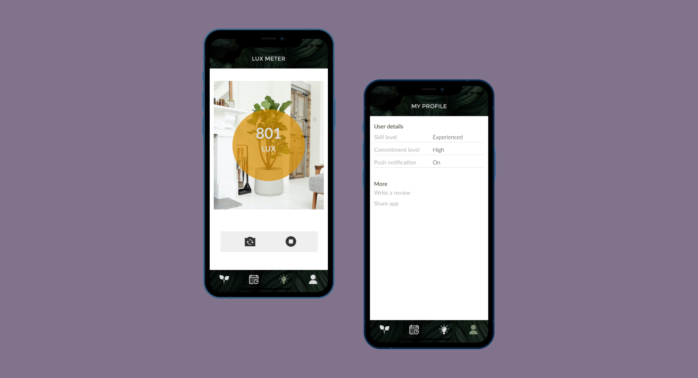
Lux meter - where users go to measure the intensity of light, it is a great tool for setting up your greenhouse light settings or checking if your area needs a bit more light.
Profile - where users go to write a review or share the app.
Mockups
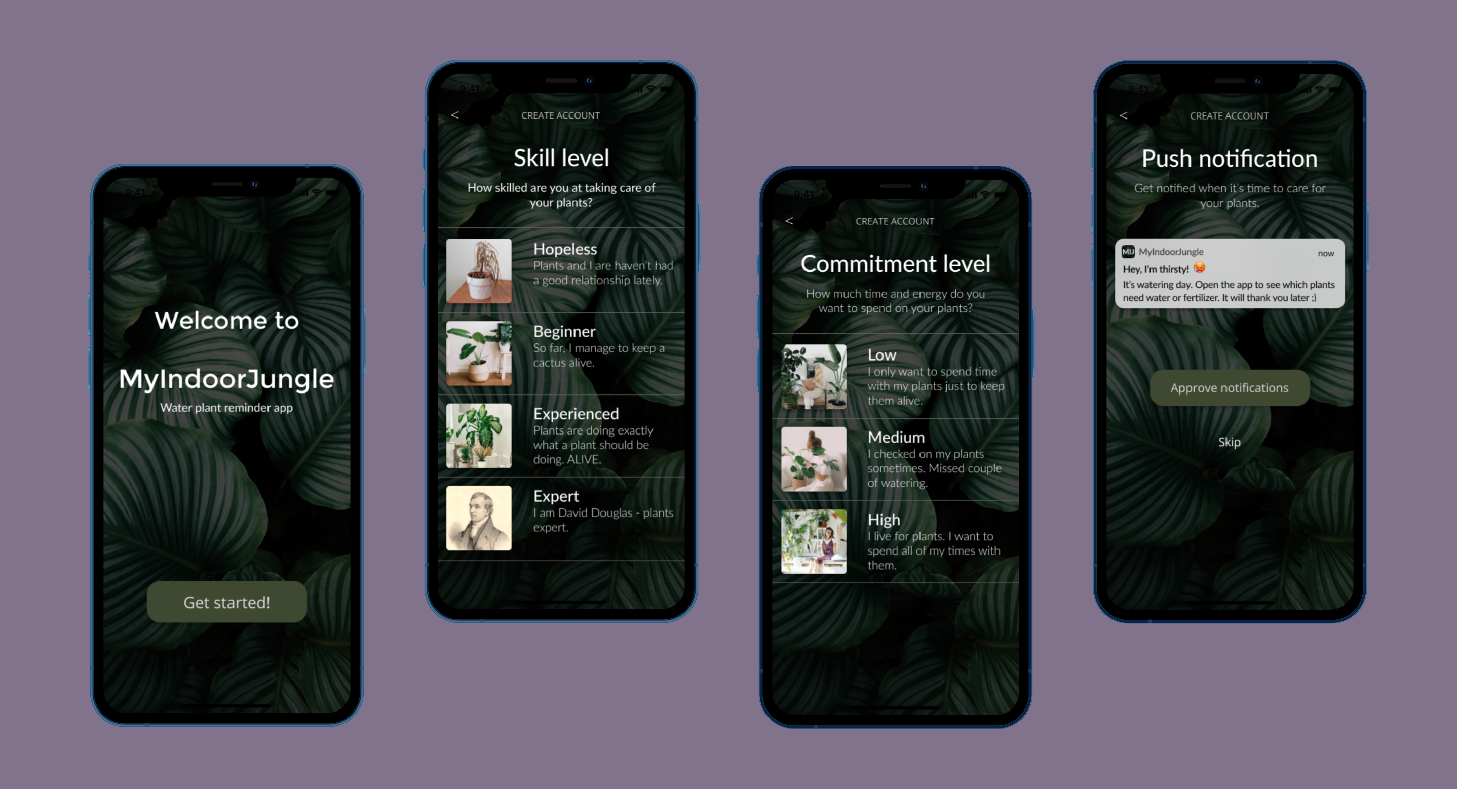
Welcome screens
Here I put some of the screens from the primary actions in My Indoor Jungle app. Main screen is to getting to know the user to understand a bit more about them and enable push notification.

