🚆 London train pass using QR code
Web app
Final year project
Overview
London is one of the cities with the largest number of people travelling every day by Tube in the UK. With life increasingly busy, customers also need to buy tickets and access to train stations fastest, most convenient and safest to meet their needs. With this project, passengers no longer have to worry about long queues to purchase tickets as much time as before and be able to scan the QR code at the gate.
Roles
Solo project, create requirements, user interface design, evaluation, prototype, implementation and testing.
Timeline
September 2019 to May 2020
Tools
Django, Python, HTML, CSS, JS, Visual Paradigm, Bootstrap.
Website
https://londontrainapp.herokuapp.comIntroduction
Problem
The problem that I investigated is that millions of Londoners using unregistered Oyster cards and “the vast majority of these have found bought at self-service machines”. Because of that, they are not being able to get a refund if their Oyster card is lost or stolen. The solution to this is by having a QR code stored on your phone, your account will be registered to TFL which reduces the number of Oyster cards lost or stolen.
With the majority of users are young adults, they are going to become the primary user. The secondary users are their relatives, friends and family and the people who are living around them. Finally, the tertiary user including the competitors, third-party partners and other investors.
Solution
Build a complete working website and be able to use it at any London Underground stations. Users can purchase or top-up ticket online.
Each passenger will be having a customised QR code that contains a user’s information and validity of the pass. The passenger then scans the QR code at the station gate that has been pre-paid before travel which minimizes the need to queue up for purchase/ top-up tickets.
The website will have a front-end and back-end system.
Literature review
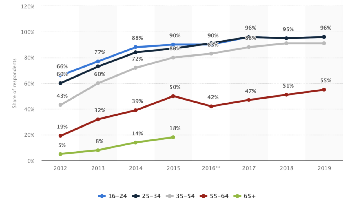
By looking at the Figure 1, we can see how smartphone ownership has become increasingly significant in recent years, with 96% of young adults owning a smartphone and a clear increase in smartphone ownership among people aged 55 above. In 2016, less than half of people over 55 years of age owned such a device, which will eventually increase to 55% in 2019. Besides, consumer demand is also diverse, young consumers are not afraid to try new methods. This result helps the QR ticket scanning solution become more successful. Also based on this figure I can use young people between 16 and 54 as the main users. Suitable for all classes.
Analysis and design
The system has 2 different user roles; these are the passenger role and admin role.
Passenger
- Can manage the online trains, see trains status, update information and be able to select the types of top-up.
- Be able to take control of their profile.
- Can access the system widely from either desktop or mobile devices.
- Users will be able to login/ logout of the system.
- Users will be allowed to request a password reset.
Admin
- The admin group has the right to view all the features available in a websites such as manage user’s information, create train posts and create new user profiles.
- Has an excellent understanding of the system and be able to answer all inquiries regarding our system.
- Ensure all correspondence is presented in a professional manner.
Presentation
Site structure
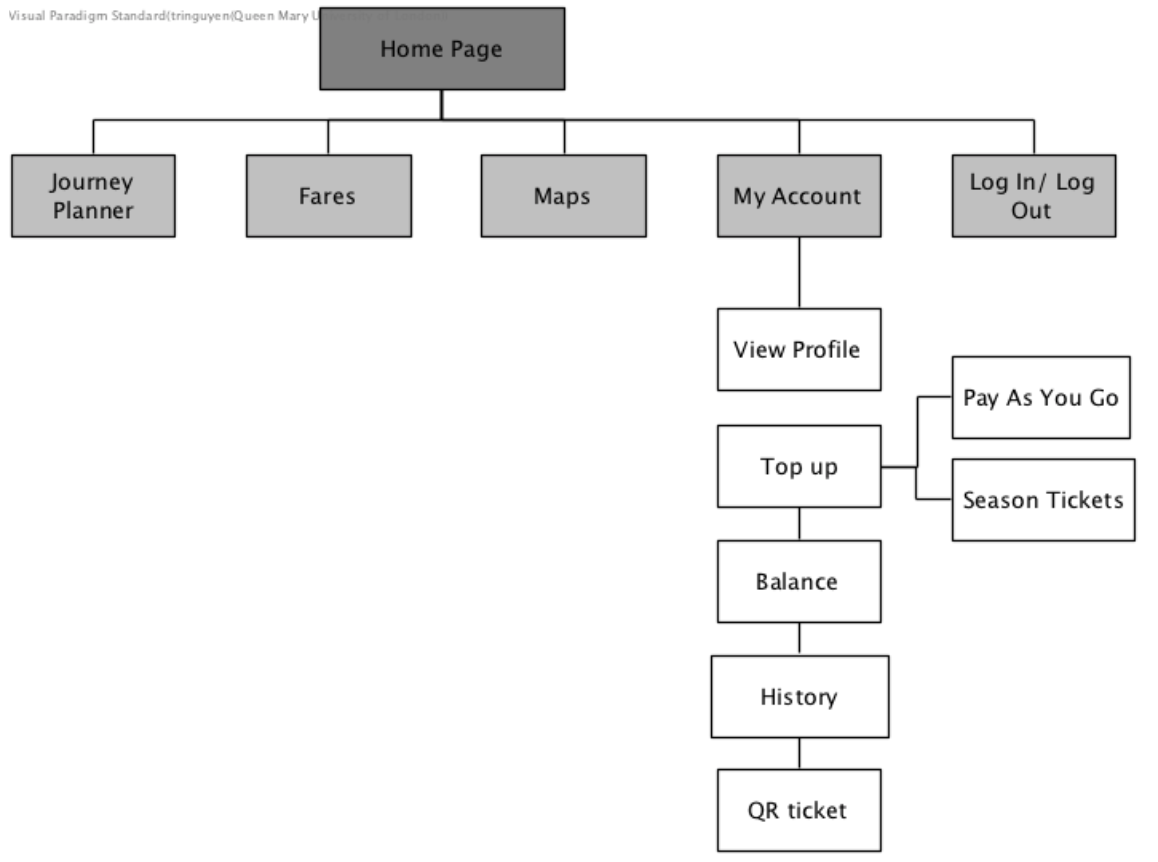
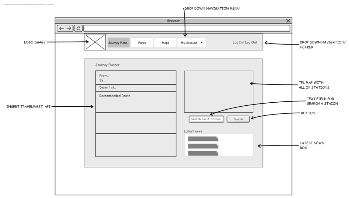
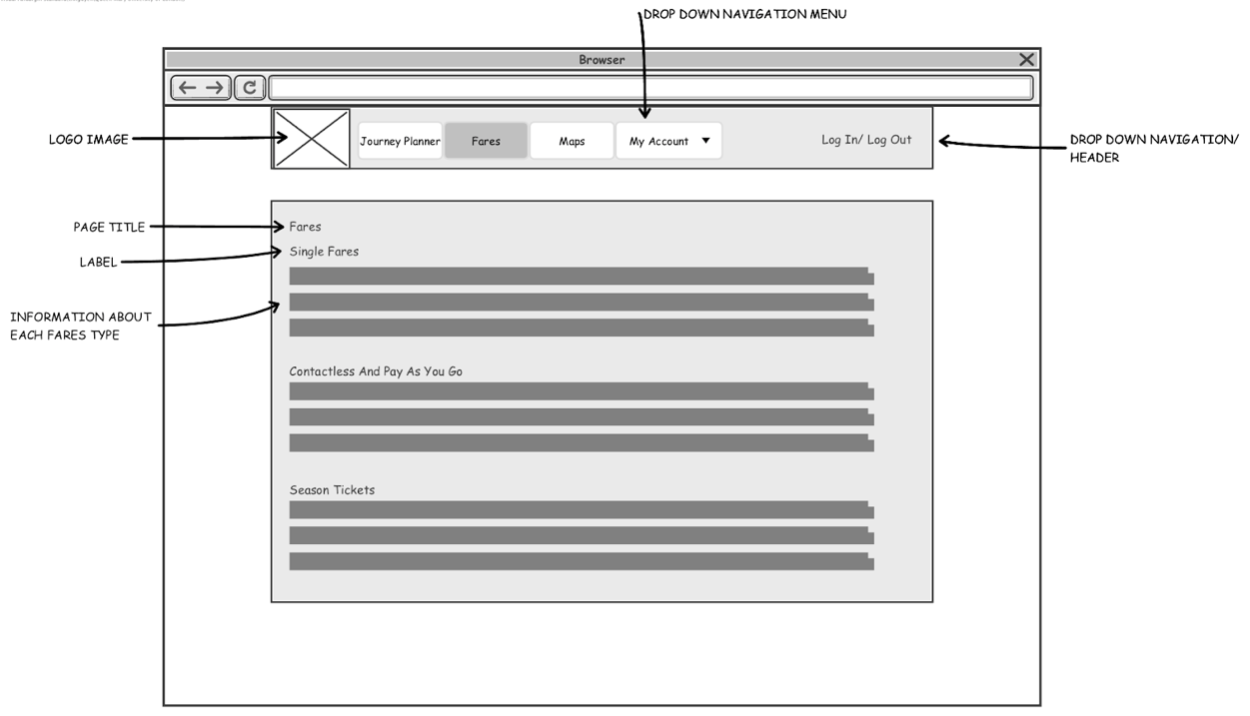
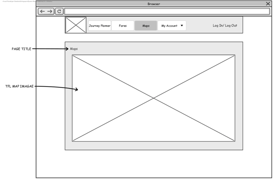
The customer interface should be appropriate and useful for the users. Before I am going to design my interface, I should have site structure - it is a key to establishing the website as the original source of my content. With a site structure, I can easily explore my creative way of designing before choosing the final design for my web GUI.
Screen layout
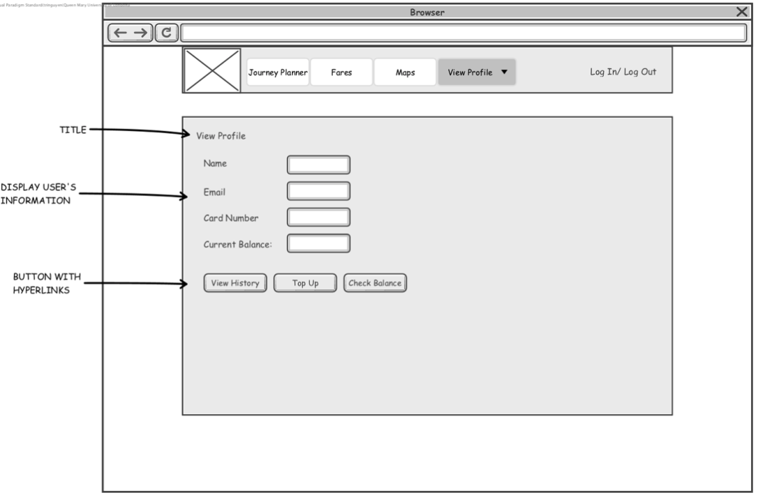
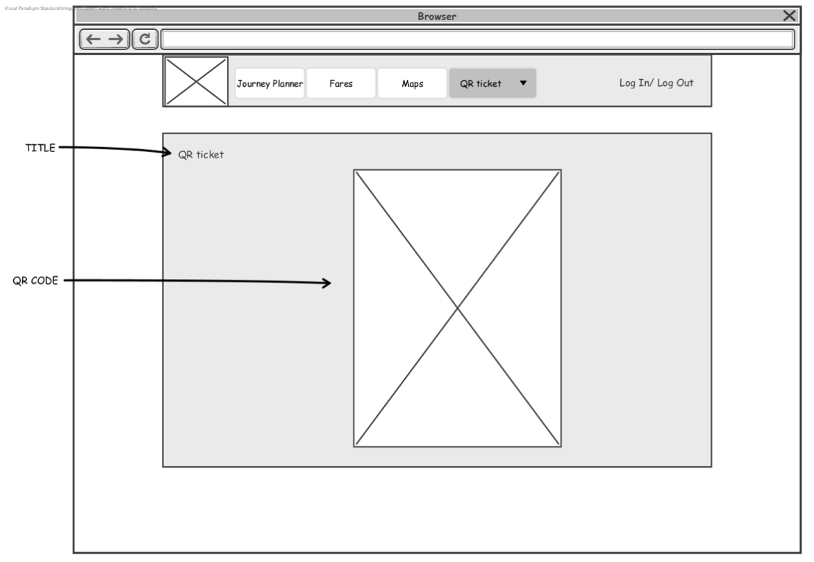
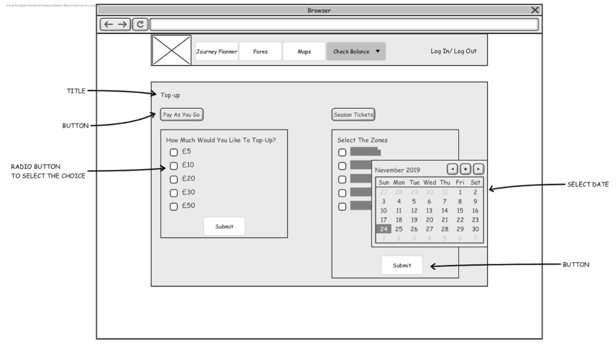
Implementation and testing
Test 1: Top-up page
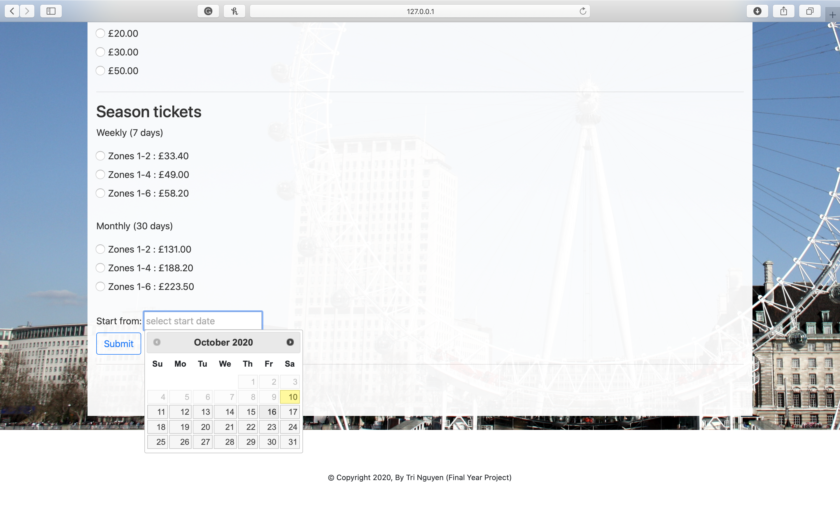
Purpose: Test the date picker function where users can only select the date from today onwards, not past dates. Users are also able to select different types of top-up.
Action:
- Select the zone you want to top up
- Select the date to activate
Expected outcome: The result should display a window with a date picker function. Today's date will be highlighted as well as the selection date. Past date will be invisible for the user to select.
Actual outcome: User selected the zones and future date. Refer to Figure 2.
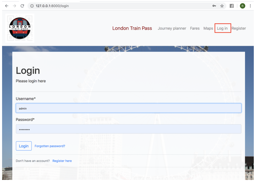
Test 2: Log in page
Purpose: To ensure that the user is registered and be able to log in with the correct username and password.
Action:
- Enter the username and password .
- Click on the Login button.
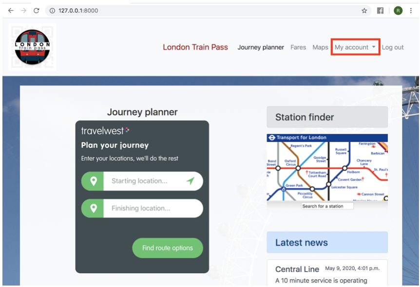
Expected outcome: User should be logged in and redirected to the Home page with My account tab on the navigation menu.
Actual outcome: User logged in. Refer to Figure 3.1 and 3.2
Test 3: Register page
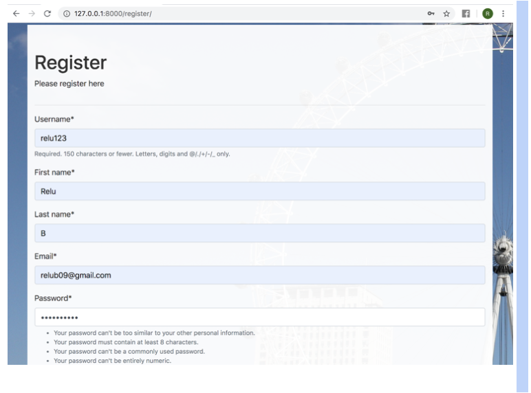
Purpose: Register page created to help users create new accounts with the site. The information that users need to fill out is the username, first name, last name, email and password.
Action:
- The user fills in the register form.
- Click on the Submit button.
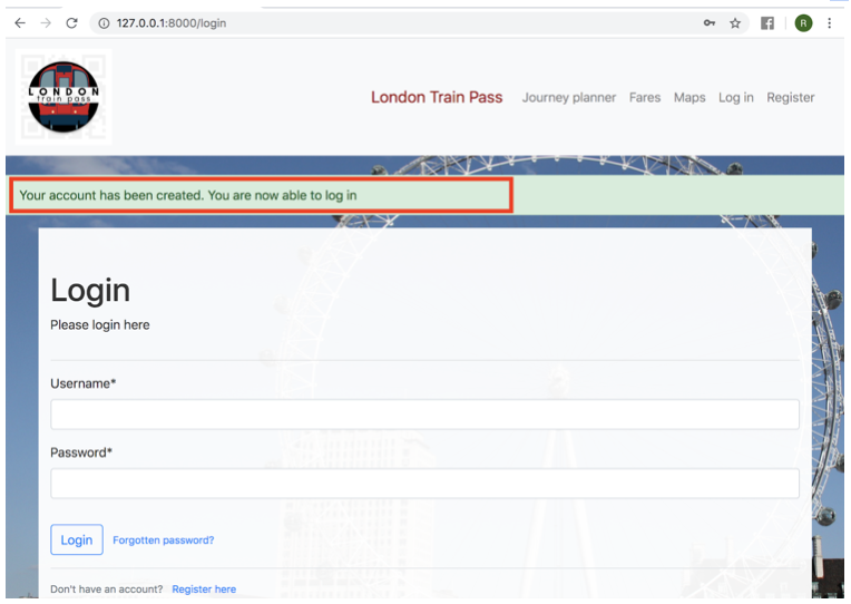
Expected outcome: To test if the register form has been created successfully or not, after the submit button is clicked, the user should see a message “Your account has been created. You are able to log in” redirected to the Login page.
Actual outcome: New user has been created, you can login now. Refer to Figure 4.1 and 4.2
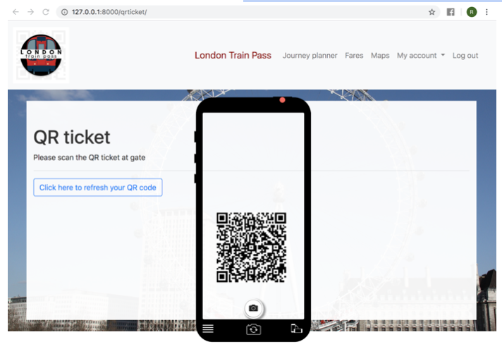
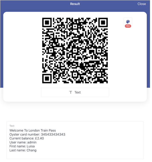
Test 4: Generate a QR code
Purpose: This test ensures that the QR code reader is able to scan the custom QR code of the user's account. Each time the user uses the QR code, they must click a Refresh button on the QR ticket page. The use of the Refresh button is to make sure each time the user makes any new purchase, the QR code must refresh and show a correct amount on screen.
Action:
- Users must log in.
- Go to My account, select QR ticket.
- Select the button “Click here to refresh your QR code”.
- Scan the QR code.
Expected outcome: The QR code reader must read the QR code and display all essential info of the user's account such as username, Oyster card number and balance.
Actual outcome: QR code scanned as expected. Refer to Figure 5.1 and 5.2
Test 5: Admin able to create a post
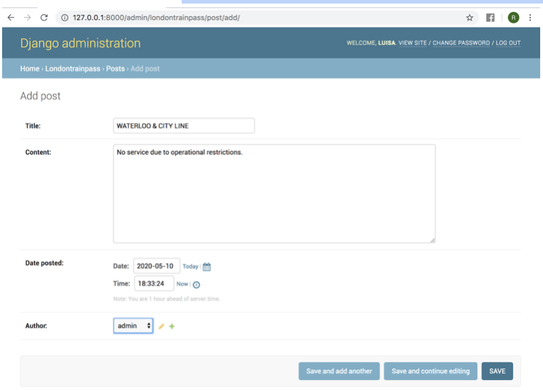
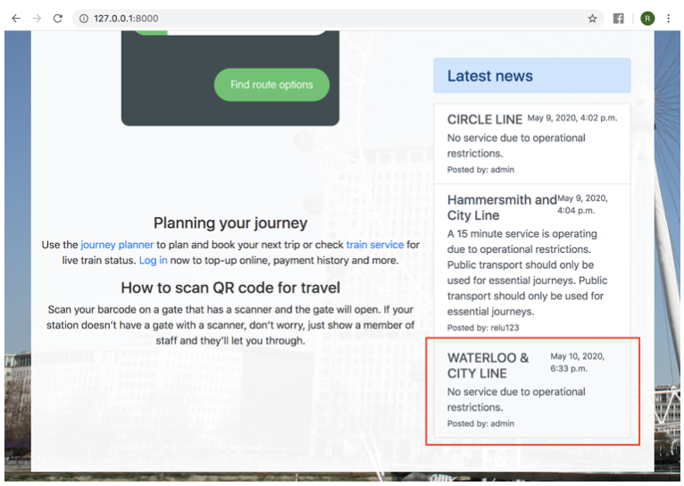
Purpose: Admin can create train posts in the back-end to be displayed on the homepage. Information will be displayed along with the time the post was created.
Action:
- Admin login to Django administration.
- Select Post.
- Select Add post.
- Enter the Title, Content, Date posted and Author.
- Click Save.
Expected outcome: New post can be created.
Actual outcome: New post created. Refer to Figure 6.1 and 6.2
Project achievements
Personal achievements
Before starting this project I had no experience using Python programming language or knowing Django well. Therefore, this whole project is like a new programming learning experience. During project implementation such as working between front-end and back-end, taking data from back-end to display on front-end (e.g. train post and user profile page), implementing the reset password page or allowing users to change their profile picture. I faced a lot of challenges and difficulties implementing it, however through different online resources and in my first semester of the Web programming module, complex functionality was implemented. This project has helped me learn a new programming language, gain new skills and be more confident in using more than 2 languages (js, html, css and python) for my web app development project. I. Not only that, I also improved my time management skills, communication skills with my project supervisor as well as problem solving skills. During the development process, I found it difficult to face the problem of not knowing how to solve it. But now I have achieved what I desired, it is commendable because this project provided me with the skills which I lack and useful knowledge that I will use in the future.
Project achievements
In order to have a website that meets user requirements, I must first research and understand the goal of the project from the beginning as to why this project is needed and what purpose I want to improve here. After having clear goals, aim and objectives, the next part is the design. As for the design of the project until the implementation, I follow accordingly and only make a few small changes. My strong point about the design step is that I design quite detailed and spend a lot of time referring to websites with similar purposes to take note of what information or functionality I should add to the website and should not. I think the strength of the London Train Pass with QR code website is simple, viewers are not distracted by unnecessary information. The website is easy to use as well as well structured. In general, if users visit my website, they can easily guess what the purpose of this website is and what benefits it has for users.
Responsive website
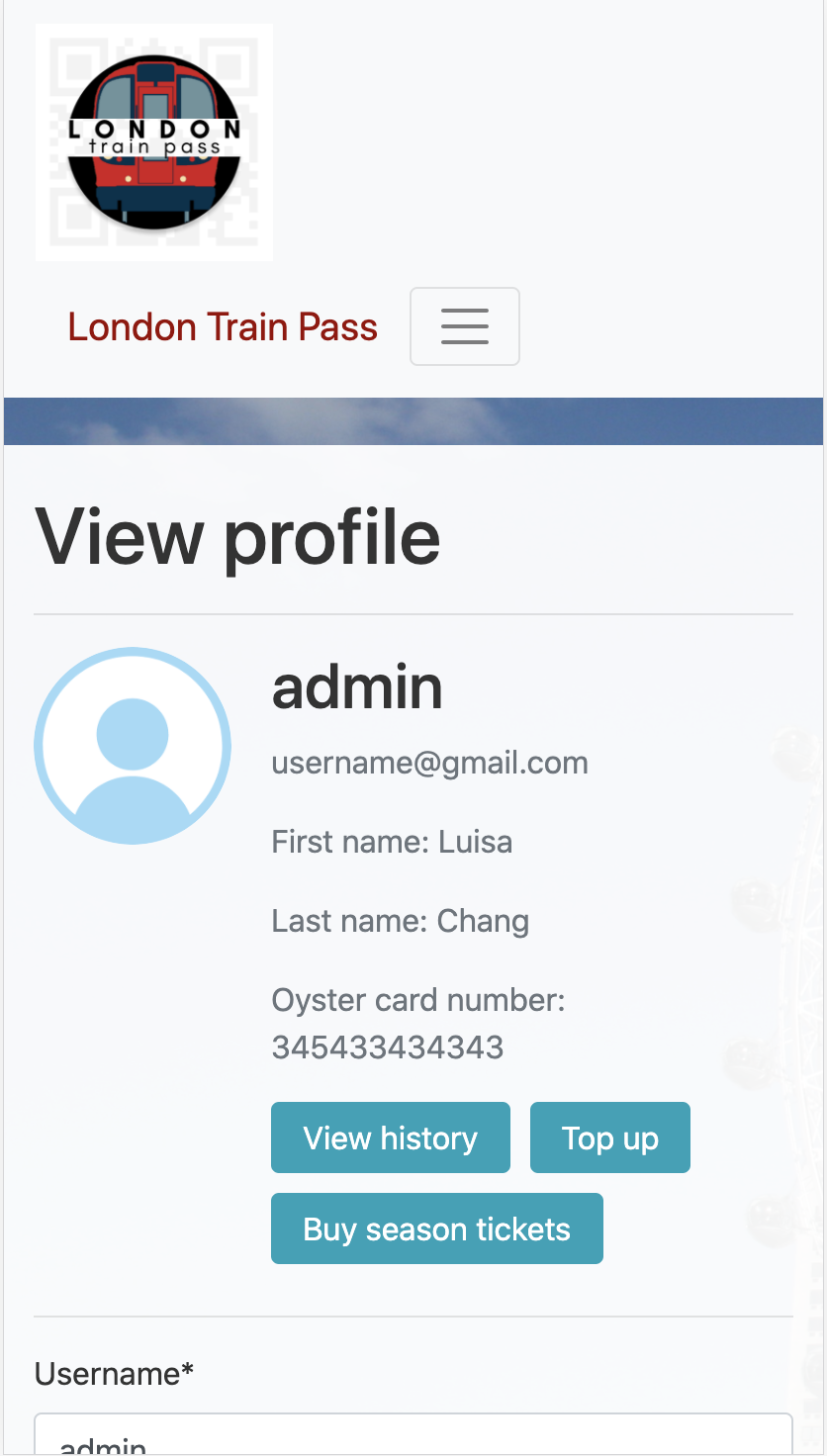
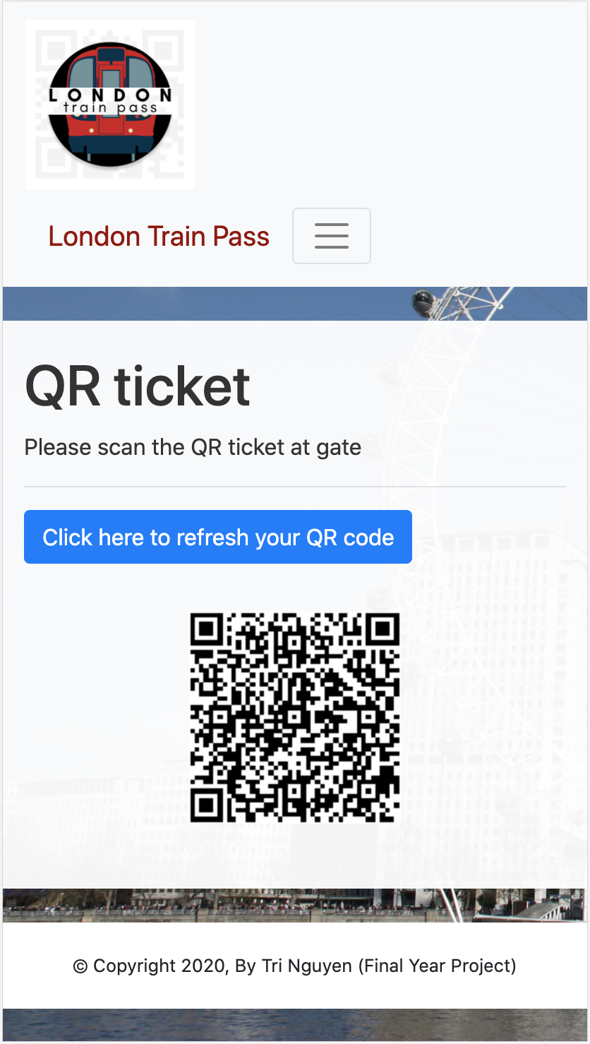
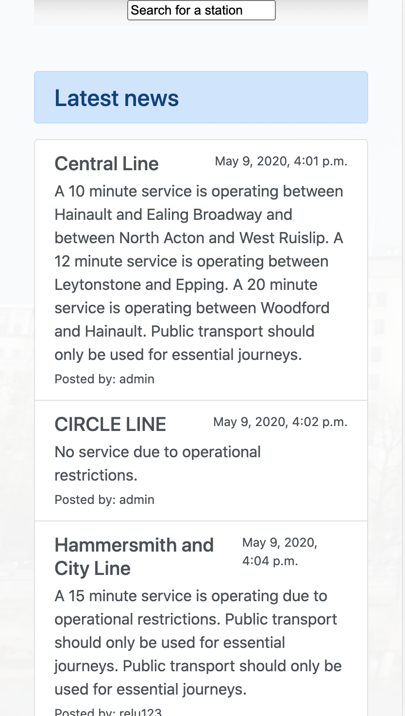
As a web application, it is necessary for users to use/ view the website in different screen size. If they view the website on the iPhone 8+ screen, for example, the website will fit the screen perfectly without squeezing the content and change the whole website's layout.
Password reset
Other project achievements I can proudly say that I have successfully implemented the password reset. This is also one of the core functional requirements which I found difficult as well. As the name implies, the purpose of this function is to provide users with a password reset when they forget the account password. This function helps users to create a new password instead of creating another account.
