📘 iEnglish
Personal project
Overview
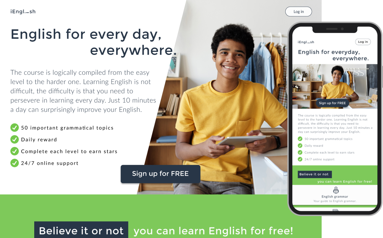
For those who often learn English through websites or mobile app, iEnglish is a web app which is recommended for those who are just starting to learn English or have lost their roots as the website will help users get acquainted with the language very quickly. iEnglish offers courses on writing skills, vocabulary, grammar, reading comprehension skills ... Besides the courses, there is a way to learn English by participating in forums and interacting with other members come from many countries around the world. In addition, the courses are free and suitable for all levels.
Roles
UX/ UI design, planning, data gathering, wireframing, prototyping and user testing.
Timeline
23rd November 2020 to 7th December 2020
Tools
Figma and InVisionapp.
The problem
There are many English learning websites out there, each with a different goal. Some platforms are free and some are paid courses. Therefore, to meet users satisfaction is challenging, causes users having unmotivated in learning and not having enthusiasm to continue the learning journey.
The goal
The goal of the website is to improve the English learning process in a way that is enjoyable but still effective. iEnglish will be a reliable, flexible and trustworthy website by its users to benefit the growth of learners. In the future, it can go further to other fields such as Math, Business, ...
As the main UX/ UI designer, I was involved in all phrases of the project, from mapping out the problem to delivering final designs.
The process
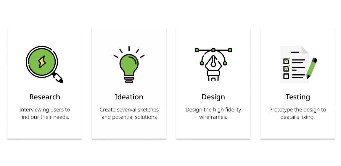
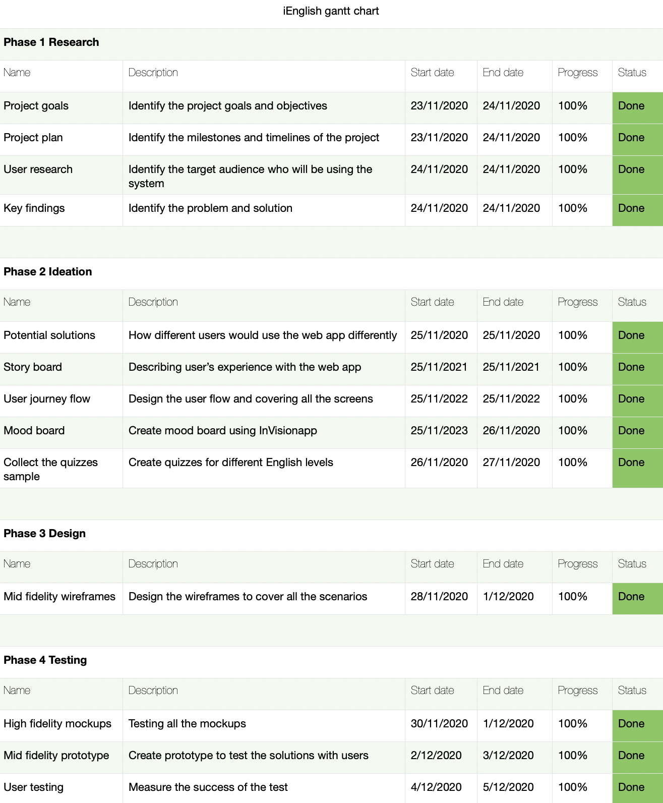
My process on this project will focus on 4 main phases: research, ideation, design and testing. From these 4 phases I will break into small tasks such as in the design phase, I have to plan on the logo design, site structure, wireframes, choose appropriate images to put on the website and etc. Most of the projects I've worked on, Gantt chart plays a very important role in the project management process. The beneficial I created a Gantt chart is to help in tracking the project progress as well as predicting start time and how long it will take to finish. Here I will summary my process for iEnglish and a Gantt chart which I created for the next 4 weeks.
Research
User research
The role of the user researcher is based on observing users in natural situations across multiple channels including moderated user research and remote user research. User research should not be confused with user testing. A UX designer often observes customer research then creating the framework, the visual design and the prototype. Basically create concepts around user journeys.
Skipping the user research phase because of time constraints or because it is difficult to prove its tangible value to stakeholders can have serious consequences for companies. Is it possible to create a product if you don't know what problems it will solve for your users?.
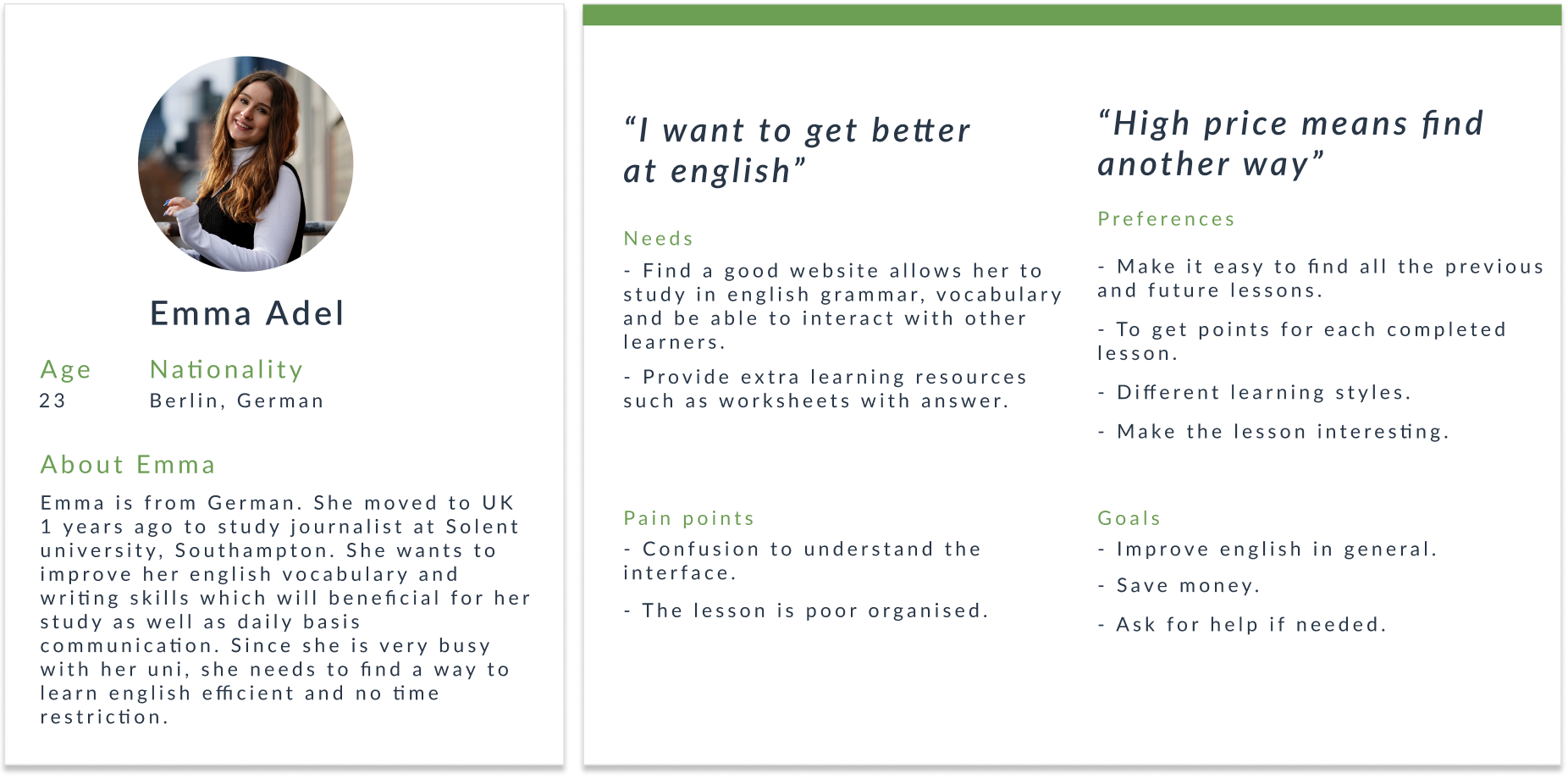
That's why I need to do user research and testing to validate every solution before redesign. I have interviewed some people who will and are learning English online, finding out why they are learning English, whether the learning process is good and effective or if you have the chance what will you change about the user interface and interaction. And here is the result I recorded in the form of a persona.
Key findings
For calling purpose users are not patient enough to explore the web app and learn new experience. They are looking for quick and easy to understand interaction.
Design
Story board
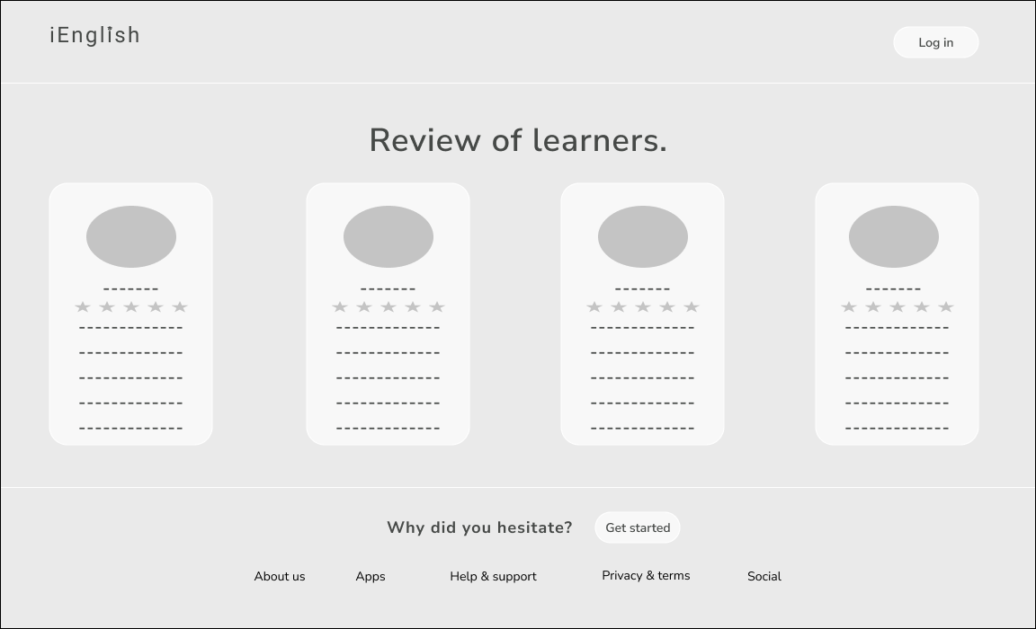
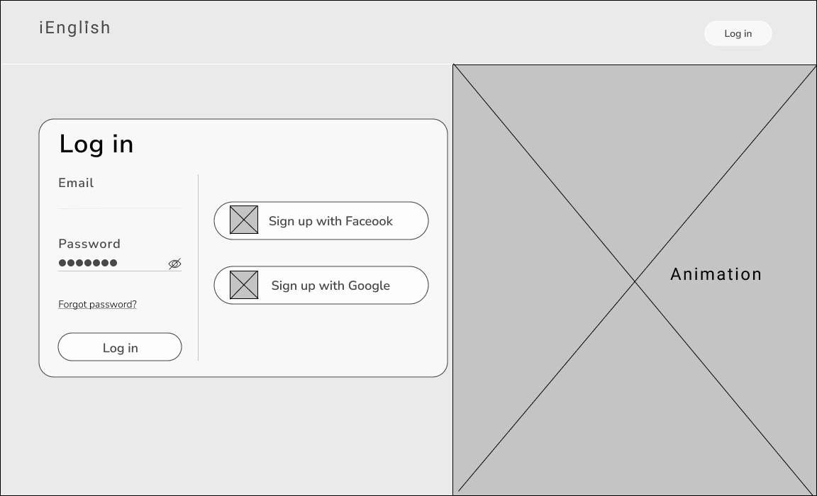
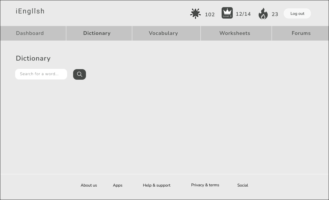
The research made it evident how different users would use the website differently. After summarizing the information from user interviews and data analysis, it was time to sketching different solutions to help users.
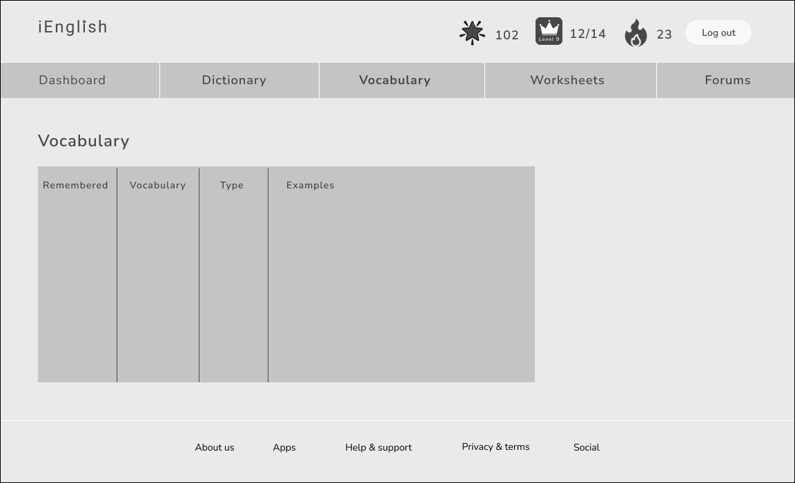
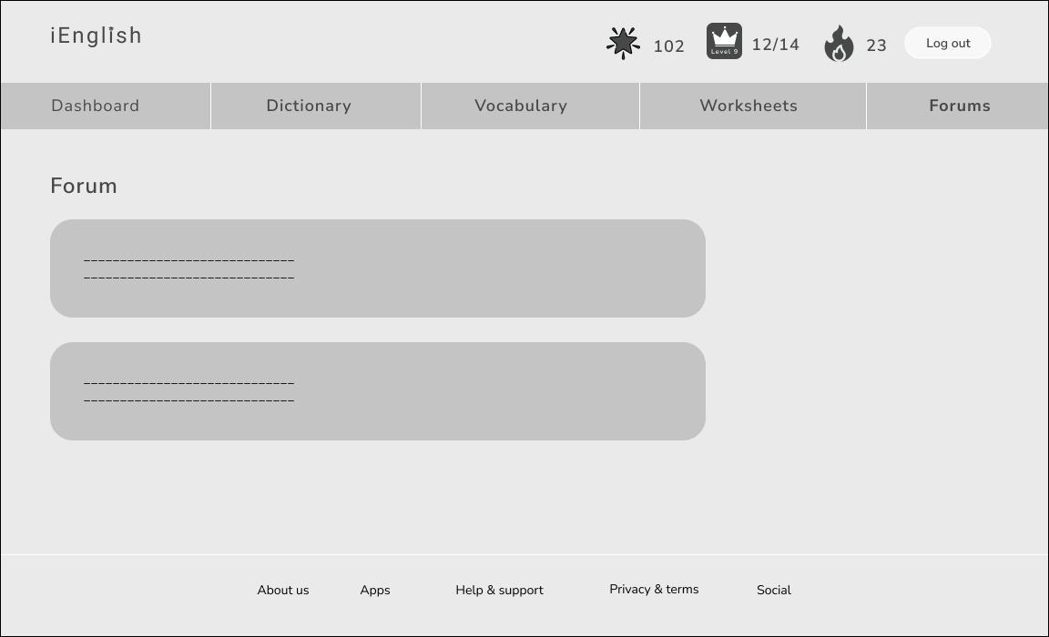
Usability testing
Mid-fidelity prototype
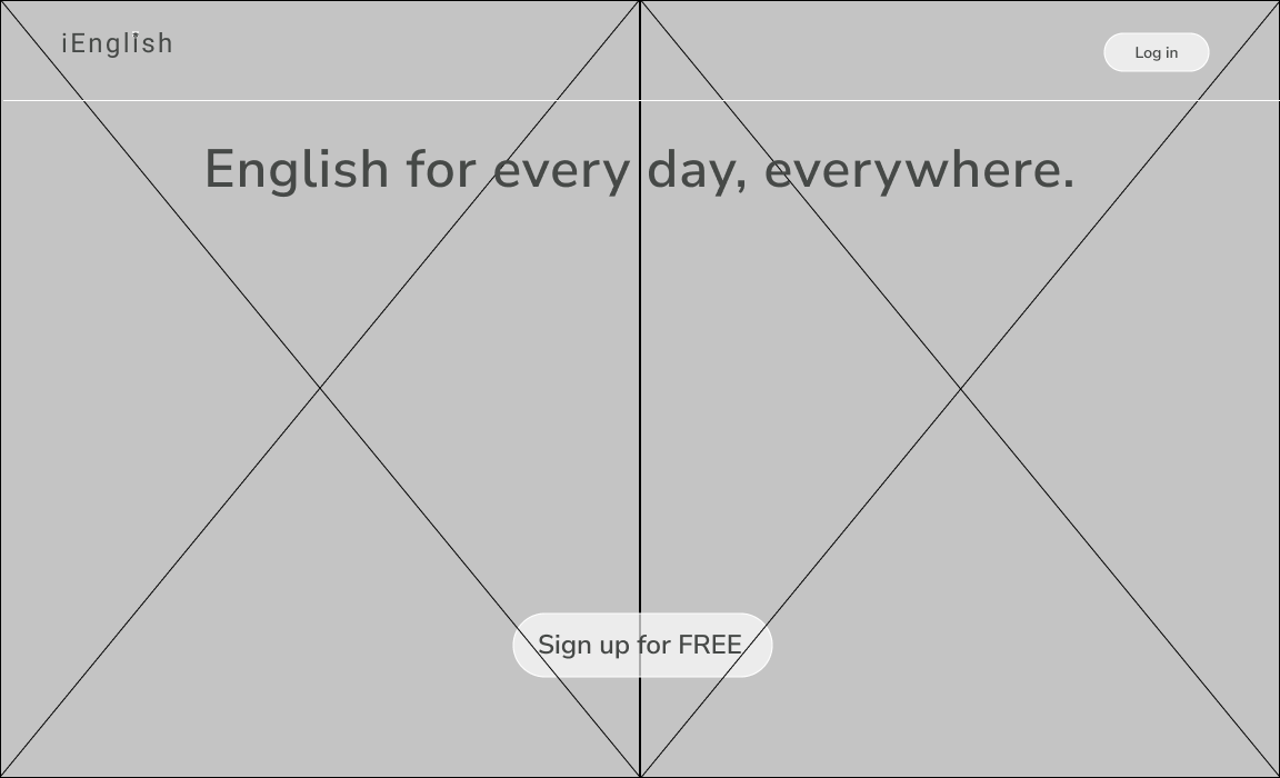
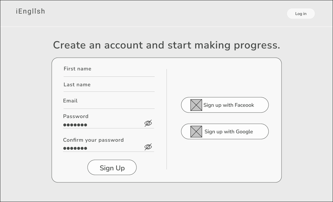
Before starting creating a high-fidelity visual design and any other implementations, I created prototypes to test the solutions with users and understand how the new solutions works.
High-fidelity mockups
Here are some of the screenshots I took from the iEnglish project mockups on an iPhone 11 Pro/ X.
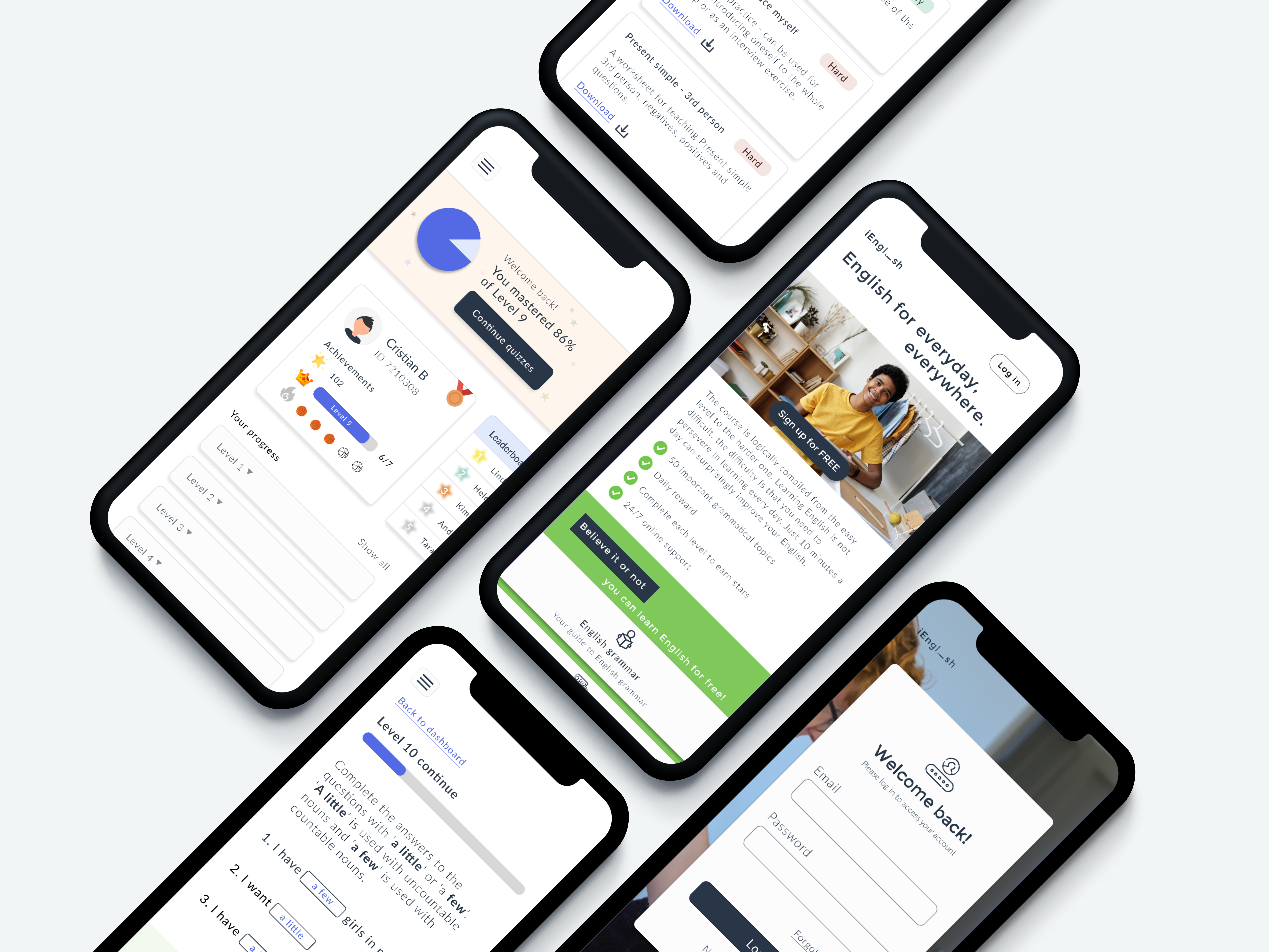
Demo on a phone mode
Project learnings
What I have learned from this project?
This personal project trained me to gain more experience in using Figma and UX/UI design skills. I have learned that one of the important principles of the design is to be consistent. It helped the design to communicate clearly and lay out well. On the other hand, if I lack consistency in elements of design, size, color, ... it can confuse the viewer and not look professional.
Not only that, this project also helps me develop visualization skills in the UI design process that helps users interact with the product. I had to decide between different typography, color palettes and imagery. The result is a product that is aesthetically pleasing to the user as well as suitable for all age groups.
Below I am going to show you the BEFORE and AFTER design, and what I think is not right and how I improved it.
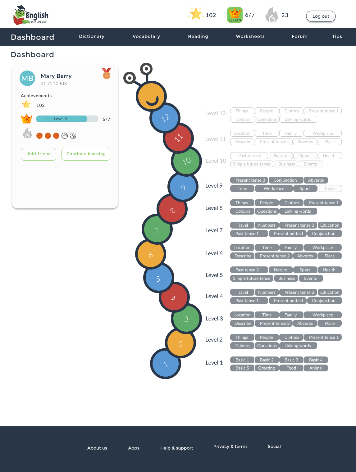
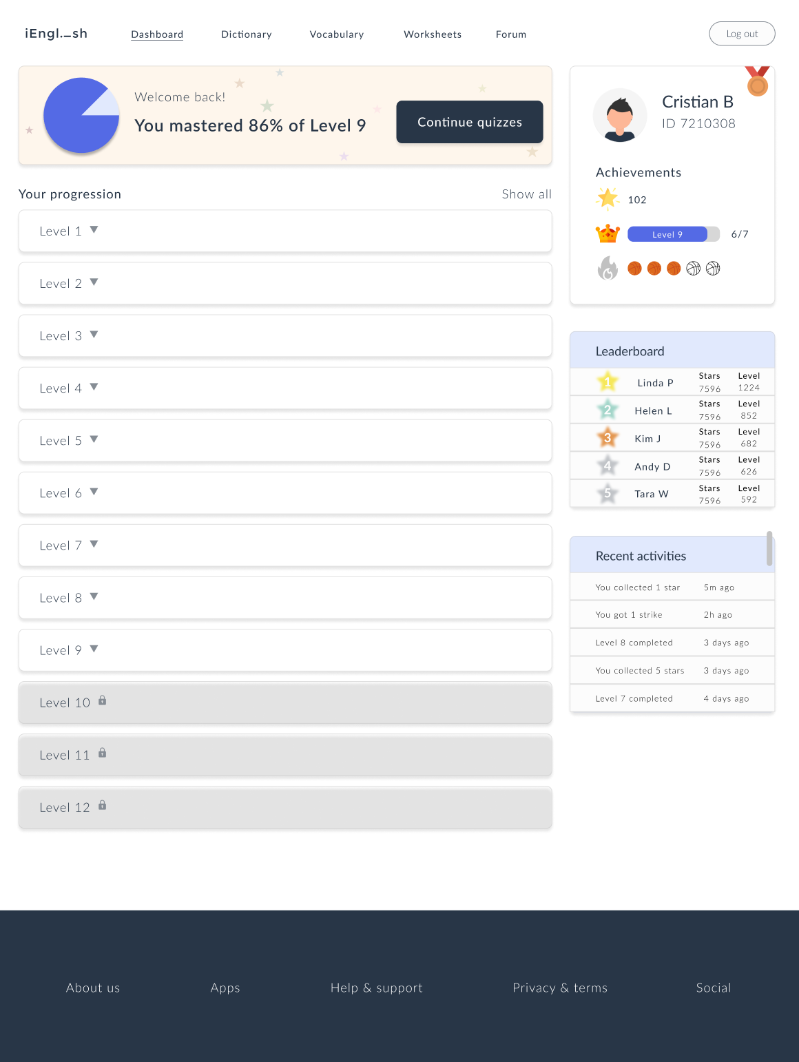
- What I think is not right:
- ❌ The logo was a bit much and hardly read.
- ❌ The choice of colours was not great which makes the website overall look unprofessional.
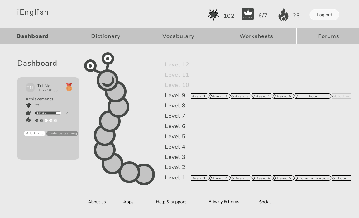
- ❌ The caterpillar took too much space on the body of the webpage and therefore, I have to squeeze in the information.
- ❌ The human eye reads a website from left to right. In this case, the primary information was not placing in the correct order.
- How I improved it:
- ✅ Recreated the logo, much simplier and fit with the purpose of the website well.
- ✅ Define a fixed set of primary and secondary colours to create a colour palettes. Use colour wheel to make the perfect colour combination.
- ✅ Removed the caterpillar helps to make the whole webpage feel much lighter, cleaner and more organised.
- ✅ Moved the user's profile to the right and the progression to the left. Before all the level's index was showing all which makes the webpage looks crowded with information. But now, I'm using container to hide it, only showing the levels title and if users want to view the index, they can click the container to view or hide again.
In conclusion, I enjoyed how this project made such a big different in my design skills when I first started and how much I practiced to get better at it. It is also an opportunity to learn how to become a better project management and I cannot wait to get started on my next project and get CREATIVE .
