9 impressive portfolio tips
Portfolio tips
As a designer, you really should have a portfolio page of your own to let your clients know what services you provide and showcase your capabilities and achievements to attract customers.
1. Create a good content
Before creating a portfolio page, make sure you have 15-20 quality products to attract customers. Never leave your portfolio page blank, but don't overdo it and fill it up. Simply keep balance. You can show them more products if they want.
2. Select carefully what you want to put on a portfolio
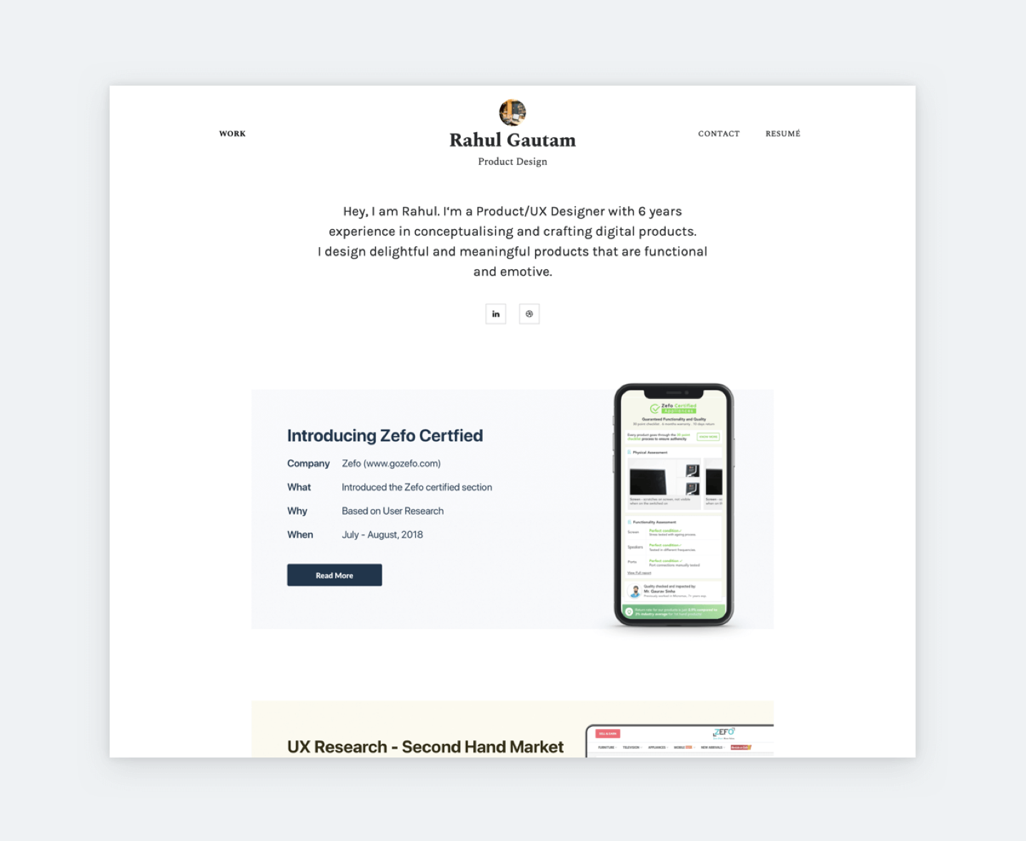
You should not put all information, details on the main portfolio page, just a few photos showing and the projects are enough. Get rid of projects that you are not proud of or you think they are not good enough. Research shows that recruiters spend less than 3 minutes with a portfolio. This might sound disheartening, but at least you can prepare for it, like Rahul did. He put short and descriptive details on his project thumbnails, so recruiters can have a quick snapshot of his projects in one glance.
3. Choose “main keyword” for portfolio
Every good story or a good picture has expensive keywords and details. So is a portfolio. Therefore, you should give employers the "keywords" about yourself. It will create curiosity for recruiters. In particular, the work achievements, successful research papers ... represented by images, impressive data will be the highlight to attract the interest of employers about you.
4. Category for your portfolio page
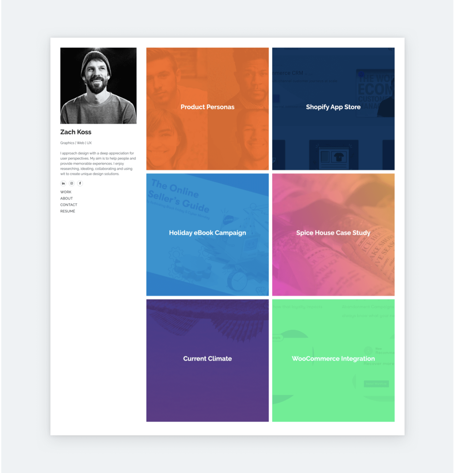
Divide your designs into categories. Like if there are logos, banners, business cards and brochures, just put them under different categories with a large, easy-to-see header that distinguishes them from other design genres. This helps the viewer navigate to the exact category they are looking for a designer to work with. Check out how Zach’s portfolio shows the power of carefully categories his projects.
5. Diverse portfolio
A portfolio set should have multiple design styles to avoid a single color scheme. You can change the layout or create a variety of designs to make your portfolio more appealing. Note that the designs need to follow a concept to avoid confusing viewers.
6. Quoting comments from previous customers
Use compliments from past clients, place those words somewhere on your portfolio page. But do not ignore those judgments. Instead, get smart and put them in an effective way so that they stand out as well as the designs on the portfolio page themselves. Previous customer reviews helped a lot in motivating viewers to become your customers.
7. A little bit about yourself
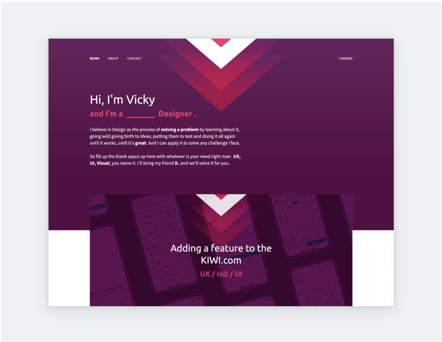
Having a "about me" entry is also a plus. Don't do it arbitrarily. You need to treat your portfolio page visitors in a friendly manner. For individuals, this is a place to express yourself. Talk about the qualifications, experience and expertise you have in your field. To make it more appealing, add whatever type of image you have, whether it's portraits, sketches or whatever represents you. Vicky’s portfolio is a good example of having a short introduction about what she does and what she passionates about.
8. Keeping up with the trend
The information on your portfolio should be constantly updated. It's best to bring projects completed within the past 3 years to show that you are still doing your work every day. However, with your success to make a name for yourself, you should still give in. Because those are the milestones in your career.
9. Information about your projects
You should also include important information on projects so that viewers can better understand the design process, goals and headlines of your customers as well as those who have participated in the implementation with you. In addition, you should also give assessments of the success of the project.
Conclusion
I hope this article will help you improve your portfolio to be more perfect and eye-catching for both employers and viewers. Stay tuned for my other portfolio tips and don't forget to update your portfolio frequently. If you have any questions, please contact me.


